Onze meesters
Bij Muurmeesters zoeken we de mooiste oude meesters uit en bieden we aan als kunstwerk voor in jouw huis. Jouw museum thuis.
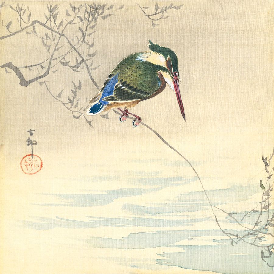
Een overzicht van alle meesterwerken vind je op deze pagina. Filter op stroming, onderwerp of kuns... Lees verder...


Onze meesters
Bij Muurmeesters zoeken we de mooiste oude meesters uit en bieden we aan als kunstwerk voor in jouw huis. Jouw museum thuis.
Een overzicht van alle meesterwerken vind je op deze pagina. Filter op stroming, onderwerp of kunstenaar.
Ben je zoek naar een specifieke oude meester? We helpen je graag! Neem contact met ons op.


Muurmeesters bij mensen thuis
Benieuwd wat anderen van de kunst vinden? Wij laten de trotse interieurs en eerlijke beoordelingen zien van onze klanten.
Tussen de beelden door lees je lovende beoordelingen over de werken en onze service.
Een inspirerende uitnodiging voor je eigen Muurmeester.

Dit is Muurmeesters
Een Muurmeester is meer dan mooie kunst aan de muur. Ontdek oude meester schilderijen op (wisselbaar) fluweel of standaard doek. Met een moderne lijst met diverse kleuren. In samenwerking met diverse musea.